PayPal Demo
My Role
UX Team Lead
Platform
Web and Mobile
UX Process Involved
Research, Prototype, Interaction Design, Visual Design, Front-End Development, User Test, Iteration.
Challenge
To develop an intuitive PayPal integration guide for those who do not know coding.
Outcome
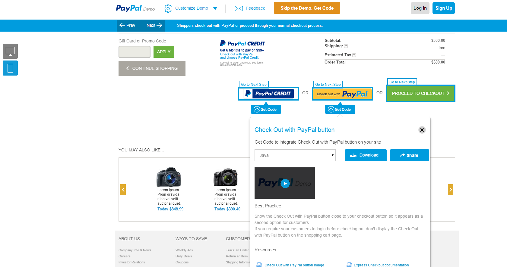
1. A demo portal where you see PayPal products in action and learn best practices.2. Download corresponding code directly from the the portal and begin integrating.
Introduction
One of the main goals of PayPal is to make payment integration to
websites easier. To help integrate PayPal buttons and APIs, there are SDKs and example
codes. However, there are tens of thousands of small to medium sized merchants who do not
have access to developers or the budget to spend on payment integration.
We built
a demo
portal where users can see the best practices and customer experiences with
PayPal. Browse a sample website to see how customers can pay using PayPal on your desktop,
mobile, or app. Also, corresponding code can be downloaded from the demo portal in
different languages. This is an all-in-one tool for non-programmers to integrate payment
into their website.
To comply with my non-disclosure agreement, I have omitted and obfuscated confidential information in this case study.
My Responsibilities
Leading the UX team from user research to user testing in an agile team and collaborating with product and project managers, app developers, and quality assurance team to create a seamless user experience.
My Involvement

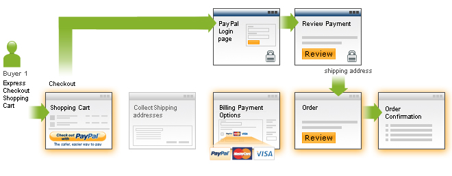
Motivation, Research, Approach and Ideation
Integrating payment gateways to websites used to be a challenging task for a lot of small
merchants. To address this issue, I developed a simple Integration Wizard 6 years ago
when interning at PayPal (Old Integration Wizard). It was a step-by-step guide to get
the code and copy/paste it to their website. This tool received much traction over the years
and was used for thousands of integrations.
There was a need for improving this tool to accomodate different devices and dynamic
payment scenarios. Most importantly, the tool needed to be more visual and align with the
users'
mental model.
Based on 4 years of analytics data from the PayPal Integration
wizard, we visualized the quantitative data to analyze how users navigated through the
wizard, spent time, clicked (heatmap of clicks), etc. We then conducted in-depth interviews
to collect qualitative data on how users utilized the system.
This gave us a clear direction to
brainstorm
and come up with a better user experience.
Design, Prototype and Improvise
The design challenge was to create a tool that would:
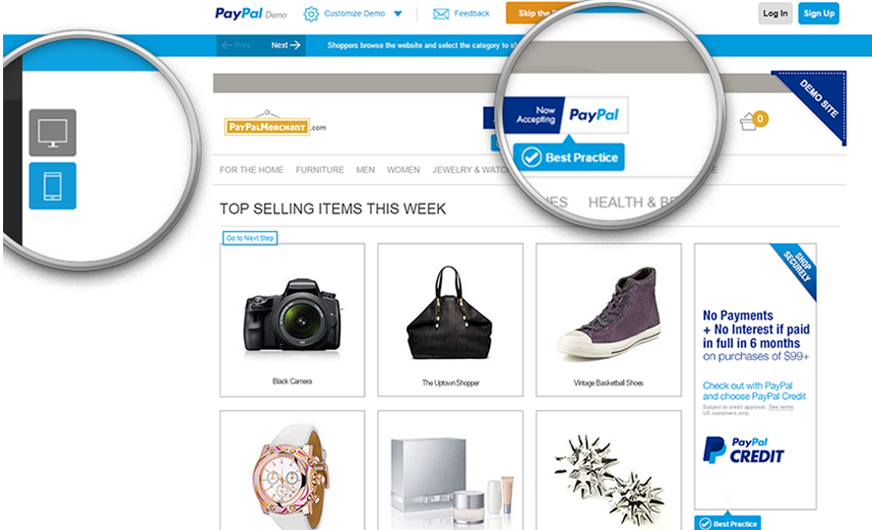
1. Showcase a demo e-commerce website,
mobile checkout scenario, and downloadable code
at
each step
2. Display best practices
3. Prompt to click on certain parts of the page and make the user experience
smoother
I made several paper sketches and low fidelity prototypes to
accommodate all of the requirements and tested each version using the Think
Aloud exercise where users say out
loud what they are thinking and what they intend to do. This gave us the opportunity
to align the design with the user mental model.
Execution
New features were added with each iteration and tested
in a real environment where users would actually use the tool. The various features were:
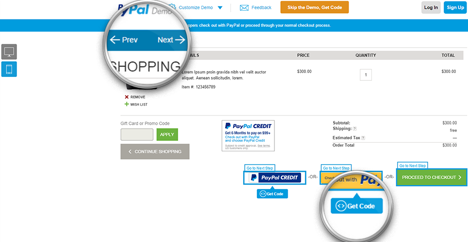
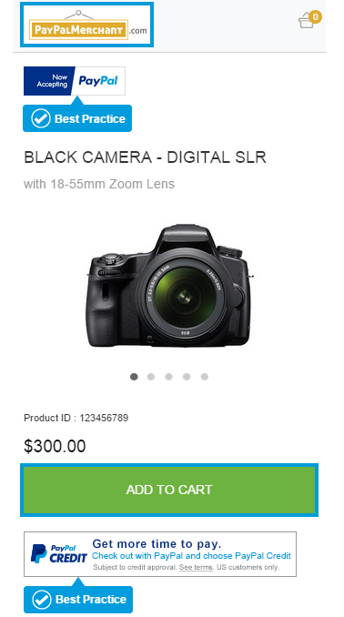
1. An option to select desktop view or mobile view of the demo portal.
2. Arrow buttons to guide user to the next screen.
3. Blinking borders to prompt user to click.
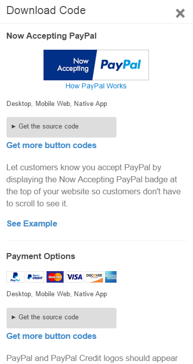
4. An option to download the code next to the PayPal buttons on each screen.
5. An option to select the language of the code the user wants to download.
6. An option to select pre-loaded credentials or their own API credentials on sandbox
testing environment.
Validation and Refinement
We conducted Heuristic Evaluation
and the reports had a few key suggestions on improvements.
The following improvements are a result of extensive user
testing:
1. Show a pop-up message when the tool is loaded to let the user know that it is a demo
website
and interactive
2. Though the clickable area is highlighted with blue borders, add a box that specifically
says
“Go to next step”, “Go to previous step”
3. Show best practices button wherever applicable
Impact Result and Reflection
The lessons I learned from this project are to involve users
at an early stage and that user testing in their natural
environment is important for the success of any project. There have been thousands
of code downloads every week and the feedback we received from the users was overwhelmingly
positive.
End Result:
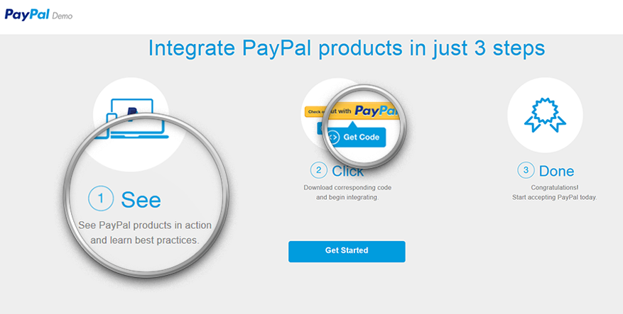
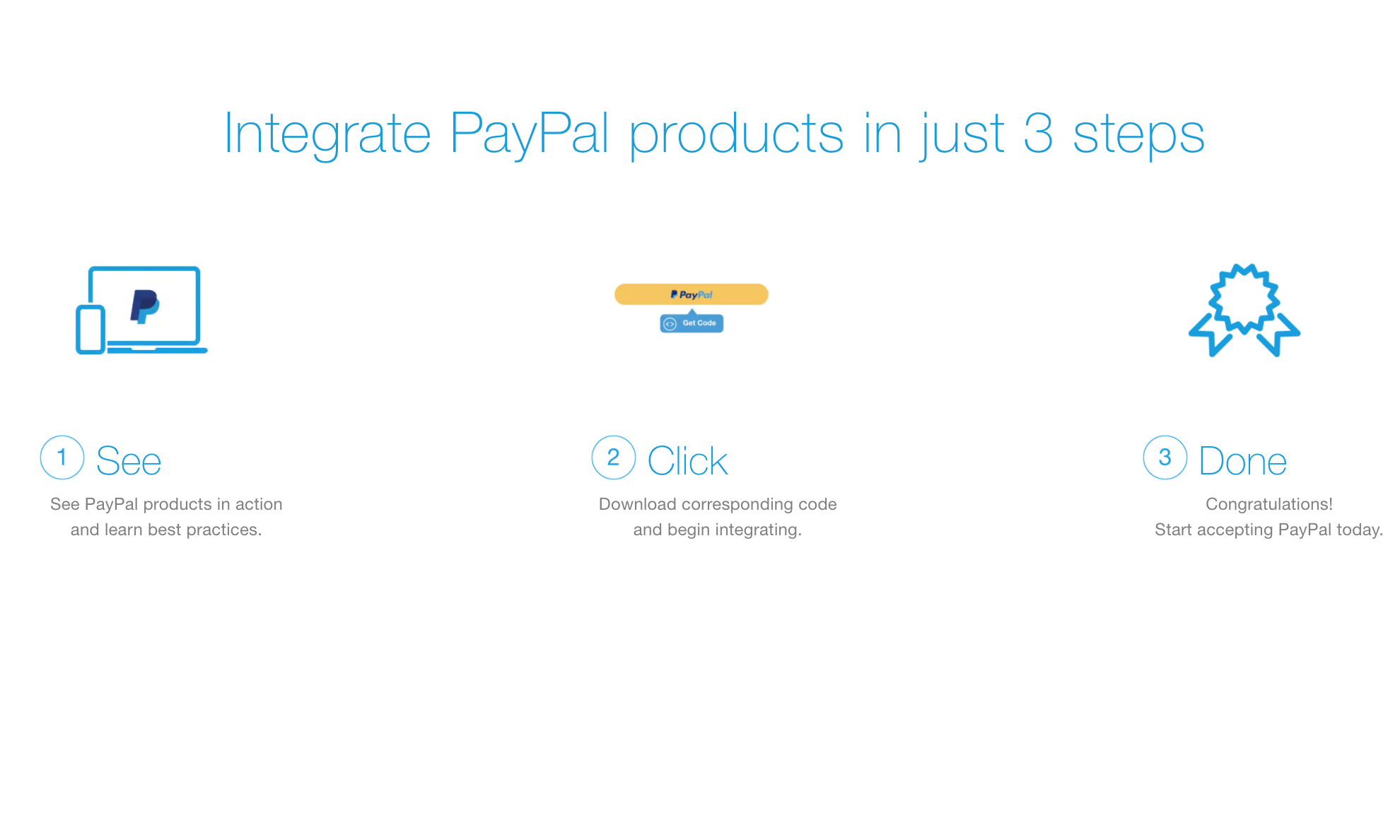
1. See - See product in action.
2. Click - Download corresponding code
3. Done
