PayPal Pay in Stores
Introduction
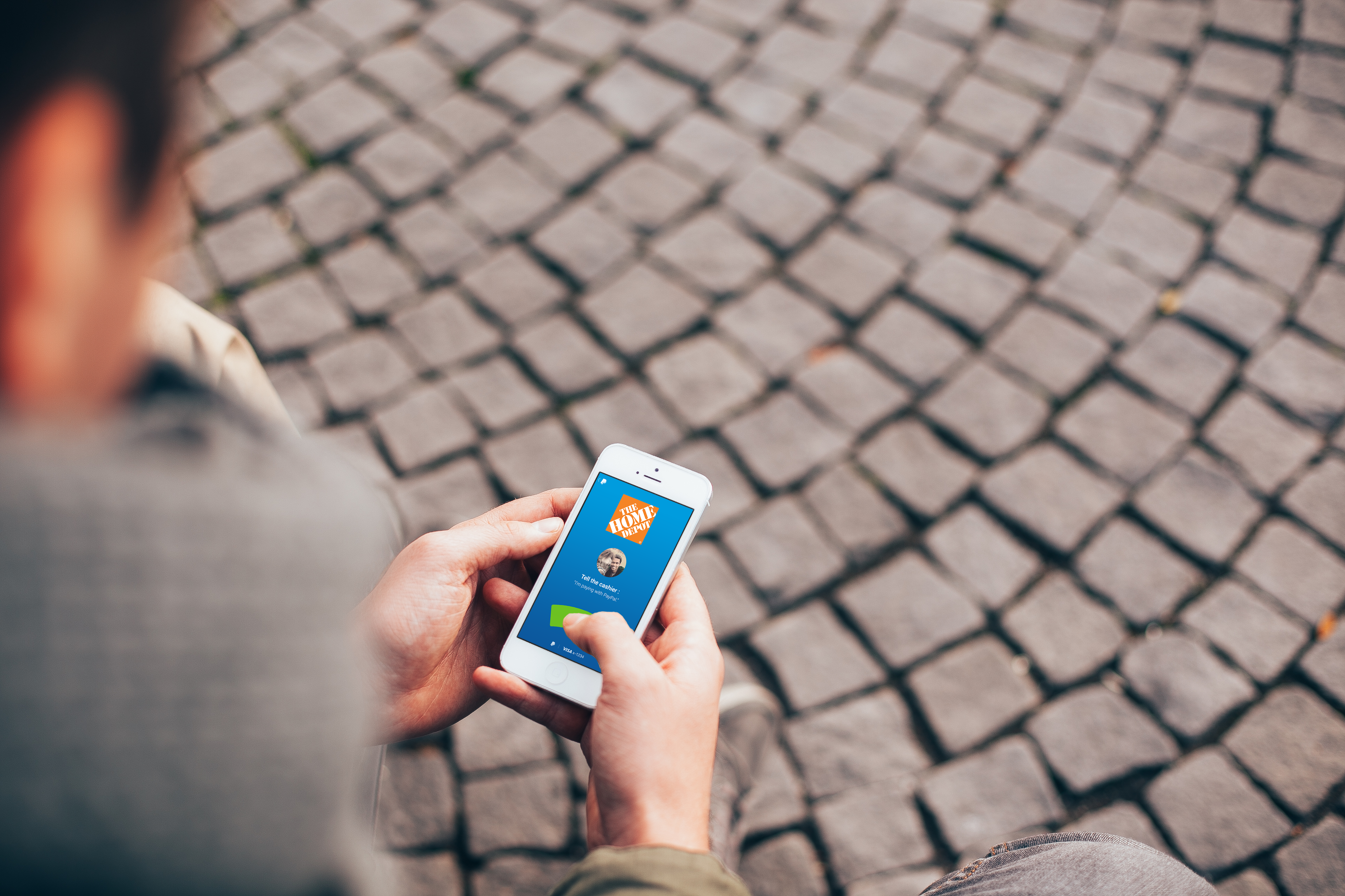
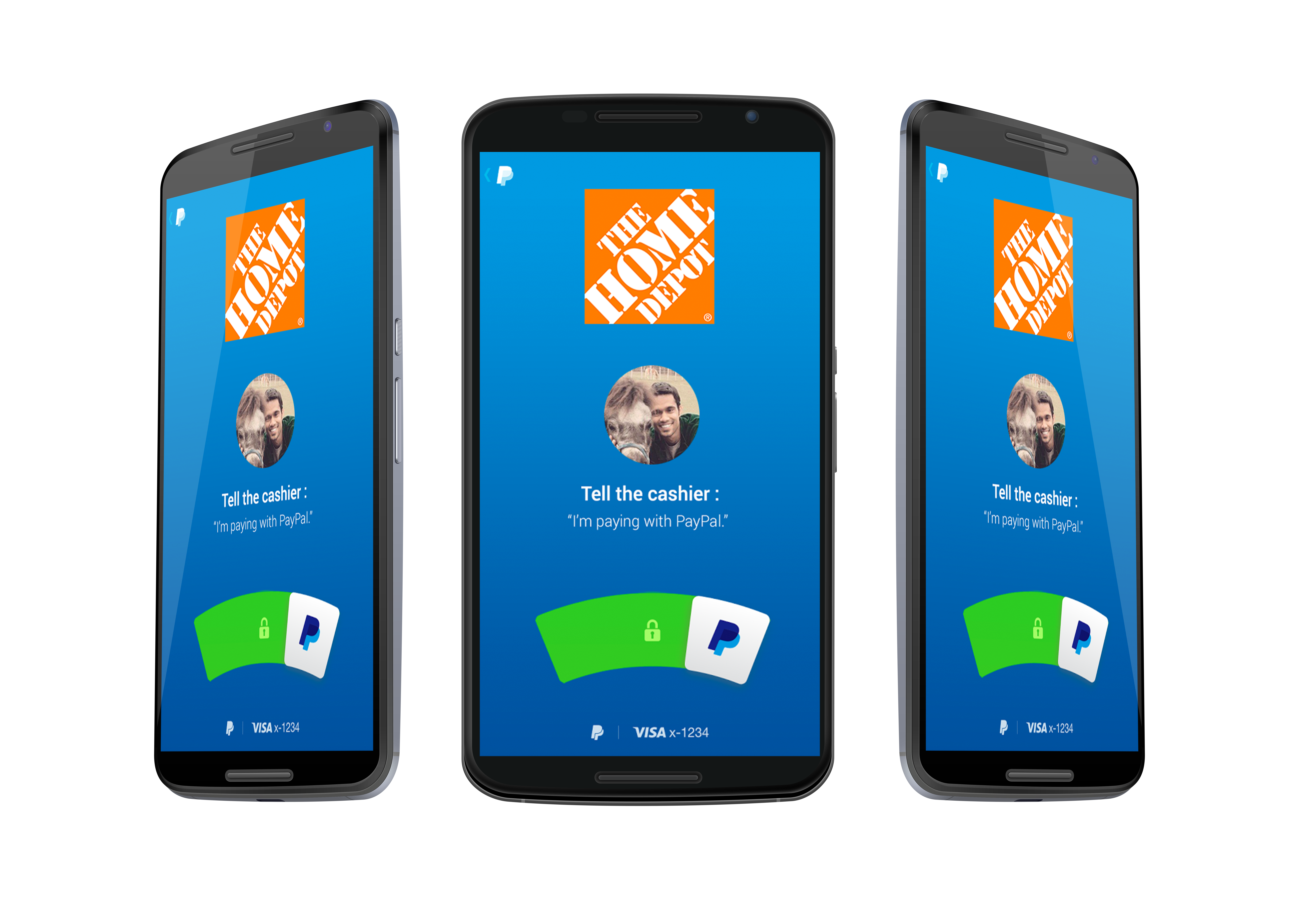
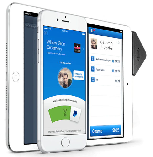
PayPal is a well known brand for secure and easy payments online. To expand the business to in store payments in UK and Canada, the challenge was to create a seamless experience for users to pay for in store purchases without having to worry about cash, card or even a wallet. What we built is an experience where the user checks in to the store to make a payment. The video shows a usecase of an in store purchase using the checkin feature we built. It involves the following:
1. Open PayPal app, find the store and check-in.
2. Pay and order, even if you are not there yet.
3. Step up to get your order without getting your wallet out or standing in
line.
Disclaimer
To comply with my non-disclosure agreement, I have omitted and obfuscated confidential information in this case study.
My Responsibilities
User Experience team lead responsible for leading the UX team from user research to user testing in an agile team. Also, collaborated with product and project managers, app developers, and quality assurance team to create a seamless user experience.
My Involvement
UX Process Involved
User Research, Persona, User Journey Map, Sketches, Rapid Prototype, Field Study
Research and Synthesis
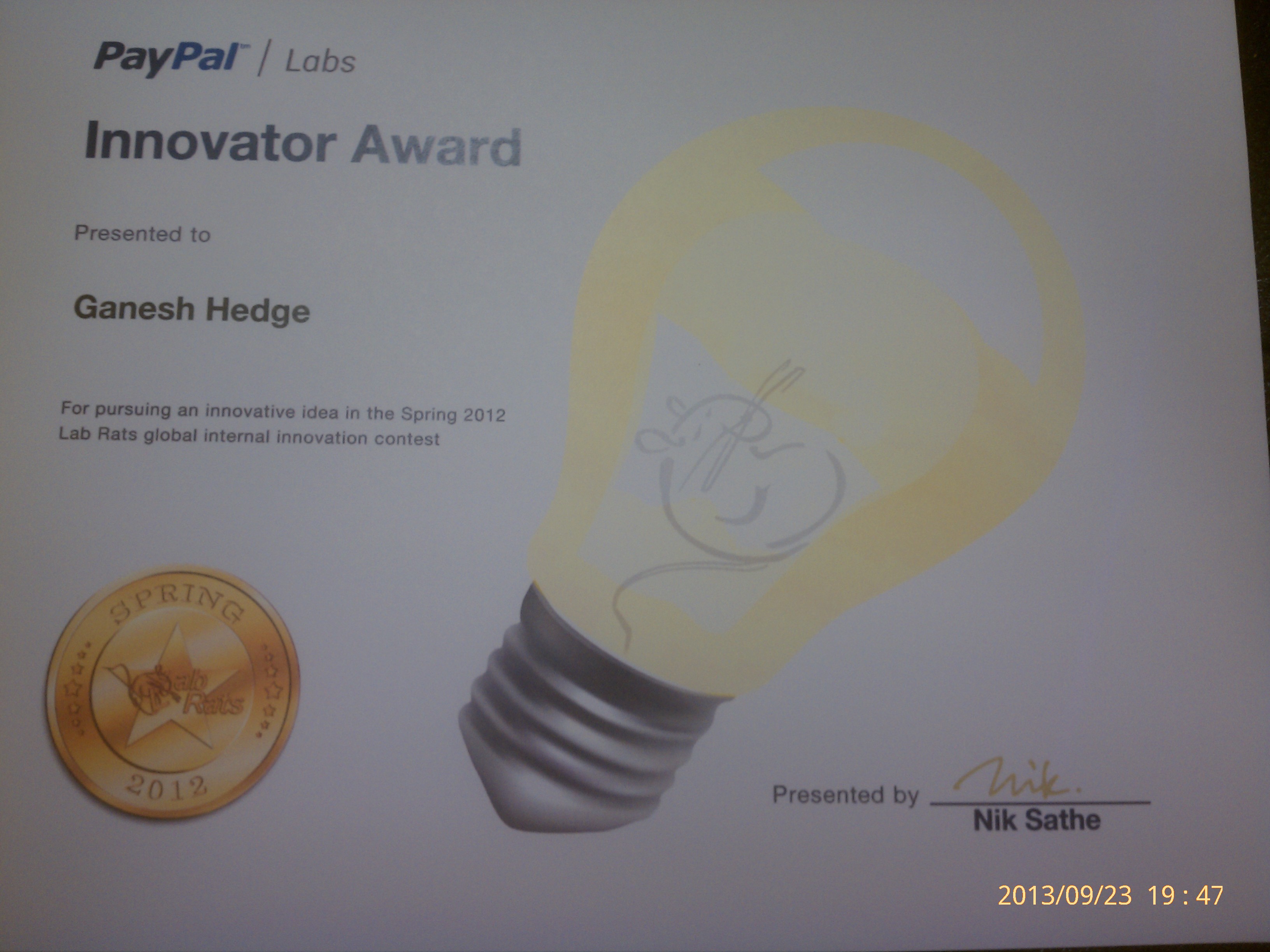
I won the global innovation contest conducted by PayPal
for the
idea about leveraging PayPal online infrastructure for “in store” payments. We
needed a
lot of research and refining of the idea to make it into a product.
The project started with comprehensive qualitative and quantitative user research
and
analysis.
We quantitatively compared and contrasted the time spent by a
customer
using different payment methods in in-store purchases( like credit card, cash, NFC etc).
We made
personas based on the research observations and results.
Once we had enough confidence in the idea through research results, we started the
prototype
and design process.
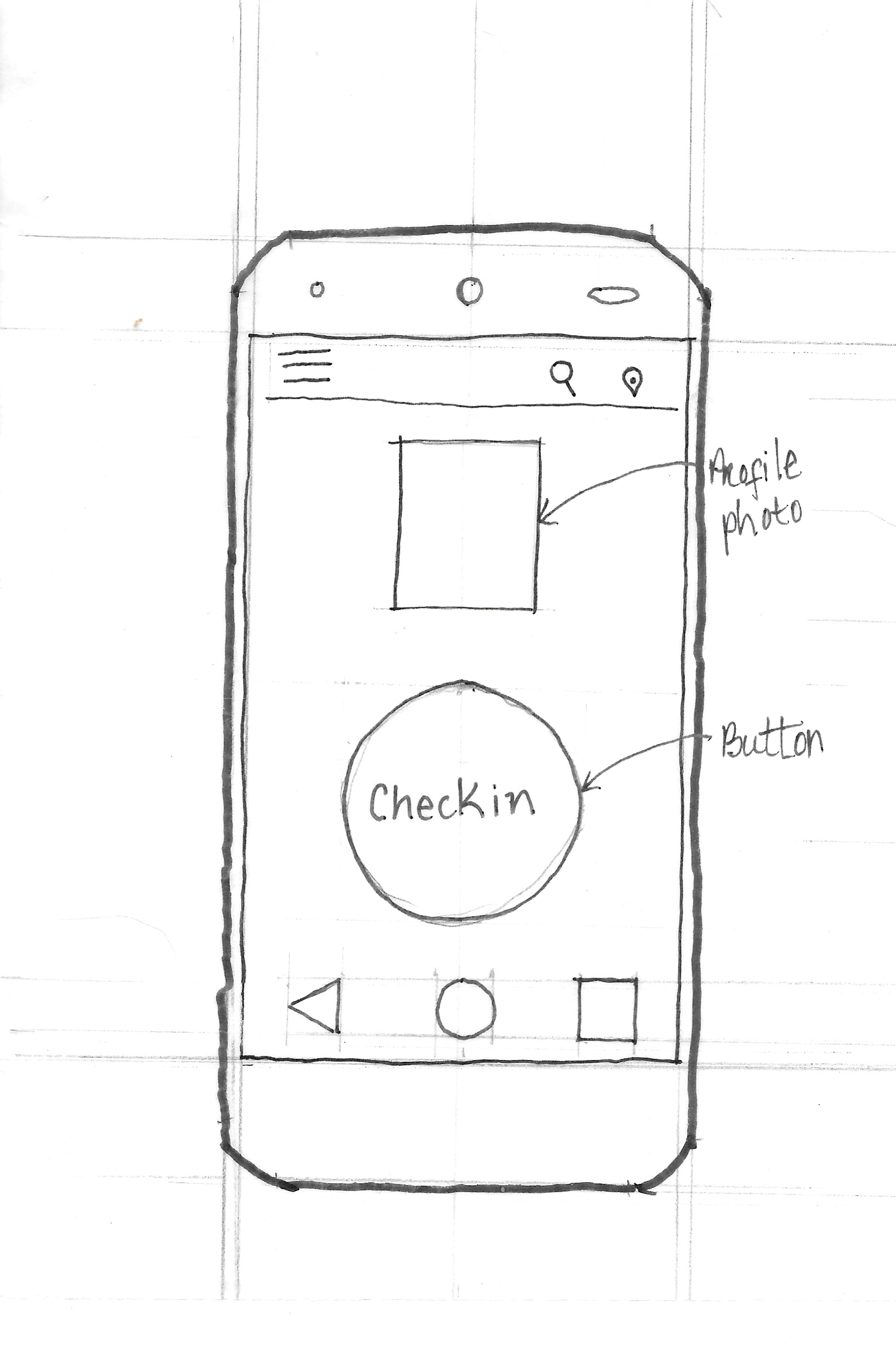
Prototyping - Paper sketches, Wireframes, Mockup App
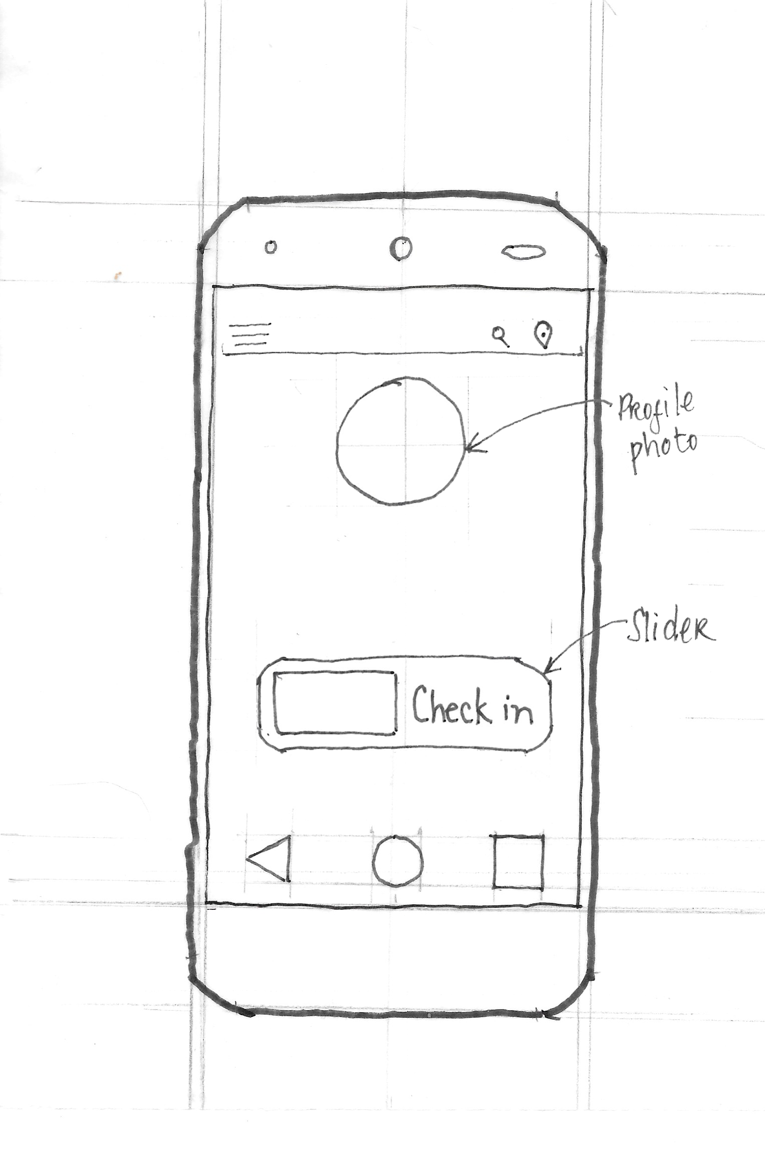
We had numerous brainstorming sessions and hackathons to come up with an idea to use PayPal for in store purchases. We researched the existing approaches and ideas. First, we drafted personas and scenarios. Based on the scenario, we made story boards.
With iterative brainstorming, we finalized three ideas to prototype.
We started with a low fidelity prototype by paper sketching, and then wireframing and finally creating medium-fidelity prototypes. We ran user studies and usability test (Think aloud) on two final designs.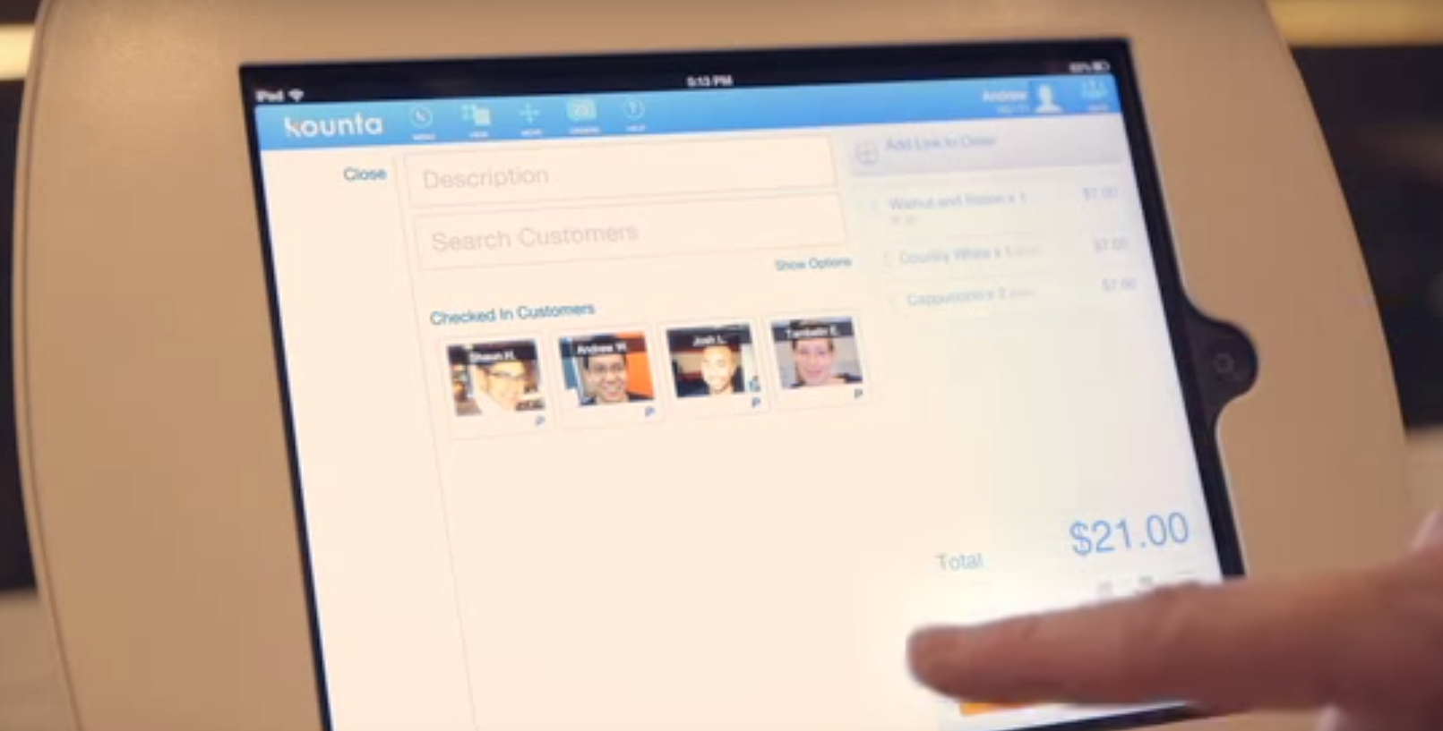
Design Process
Low fidelity prototypes played an important role in visualizing the idea. Once the idea
of
“checking in” was
finalized through preliminary user testing, the focus shifted to designing an intuitive
interface.
Scenarios based on personas helped us better understand and visualize the user
interactions.
We storyboarded the ideas to communicate with the stakeholders.
The other part of the design
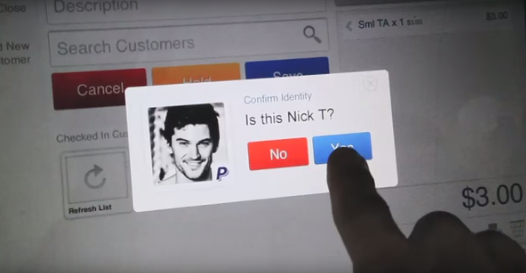
process was to make the UI for merchants. When a user checks in to a store, the merchant
screen displays the user picture with name. When a user walks up to the counter to collect
the
goods, the cashier verifies the user by looking at the picture on the screen and charges
the
customer. This interaction makes the transaction secure and easy.
Validation and Refinement
User testing was one of the important parts of this project.
We
tested the app every week with various participants in the lab. Once we developed the
high
fidelity prototype, we tested it in real usecase scenarios. One of the biggest
improvements
that resulted
from user testing was adding a feedback mechanism for every action the user performed on the
app;
for example, when the cashier charged the customer, the app screen would update with what
was
purchased and display this information just
above the
checkin button.
Result and Reflection
The app was a huge success in UK with millions of downloads- an
experience
that changed the way customers pay for things. For the shop owner, it helped to build
personal
connections because the payment was made by looking at the name and picture and
interacting with the customers. For the user, there was no hastle of taking out the wallet,
swiping cards, counting change, etc.
From ideation to user testing, it was a
constant
reminder that users are different from me. Also, frequent user testing and refinement
are
key elements in the UX process.
