Deep Sea
Digital Oilfield System
Leak Detection
Production Forecast
Visualization
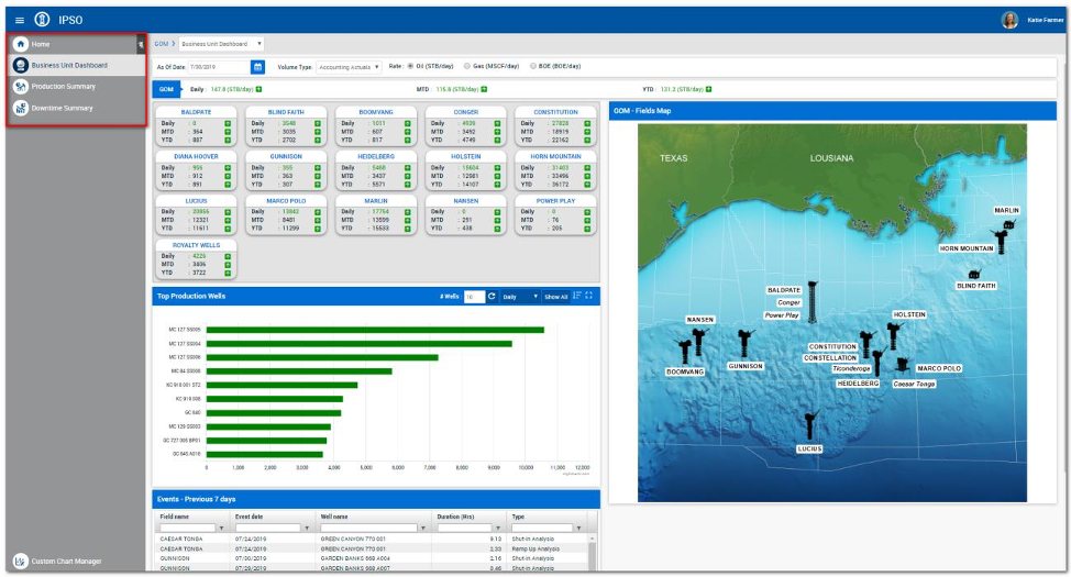
One-stop tool for several deep sea oil extraction businesses including Leak Detection, Field Automation, Telemetry, Data Management, Data Analytics, Visualization, Business and Technical Workflows, Modeling, Simulation, and Optimization.
My Role and Process
As a Product Manager, I was tasked with collaborating with executives, business analysts, petroleum engineers, development team, and UX designers to ideate, prioritize, design, and develop the Leak Detection system.
Conduct user research and data analysis to identify the needs
Ideate, define the features and roadmap
Manage and prioritize information architecture, interaction design, and content strategy efforts to develop and iterate.
Research
Conducted user interviews with oil production engineers, product owner, business analysts, and other
stakeholders to collect product visions, goals, and business and regulatory requirements.
Conducted contextual enquiry to gather in depth understanding.
Organized focus group sessions consisting of 4-8 participants throughout different stages of UX design. Led the discussion and exercises on datapoints collected in previous stages. Received verbal and written feedback from participants.
User Interviews: wants ≠ needs
Synthesis
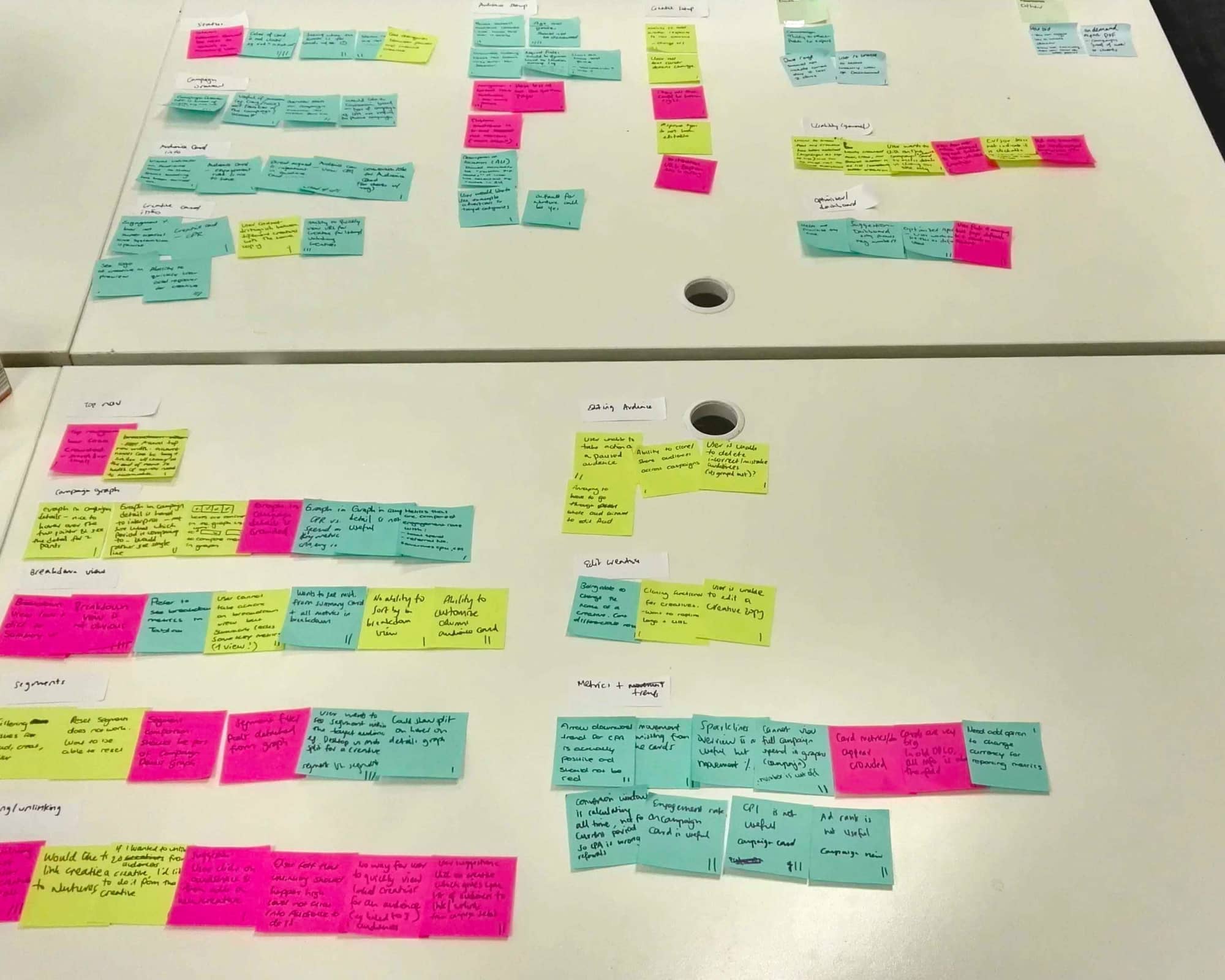
After collecting recordings from the user interviews, we conducted affinity mapping with the team to synthesize structure of the tool. We grouped these problems under common themes and features in the platform. Then severity analysis was performed on each of these tasks and features.
Task Criticality x Impact x Frequency = Severity
Task criticality - how important is the task to the user? (1 = low, 5 = critical) Impact - how much of an impact does this issue have on the user's task? (1 = suggestion, 5 = blocker) Frequency (%) - how many times does this come up out of total participants?
Roadmapping and PrioritizationUsing BUC (Business benefits, User benefits, Cost) analysis coupled with RICE (Reach, Impact, Confidence, Effort) analysis, categorized solutions into broader Epics to make product roadmap. Product, design, and engineering teams came to the conclusion that the first Epic we would prioritize would be the interactive chart.
Design
Design Requirements: Keep it simple, focus on functional requirement, and design for performance
The design phase of the project was collaborative (involving input and ideas from UX team, petroleum engineers, development team, etc.) and iterative (cycling back upon itself to validate ideas and assumptions).
Building on the user feedback loop established in previous phases, the premise of the design phase was to put ideas in front of users, get their feedback, refine them, and repeat.
Put design in front of users, get their feedback, refine them, and repeat
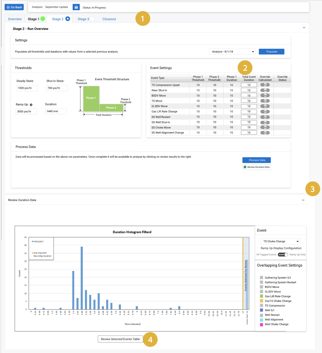
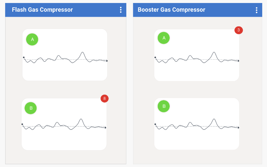
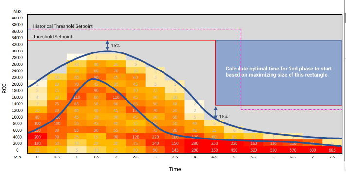
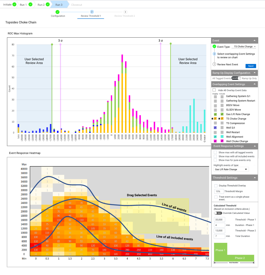
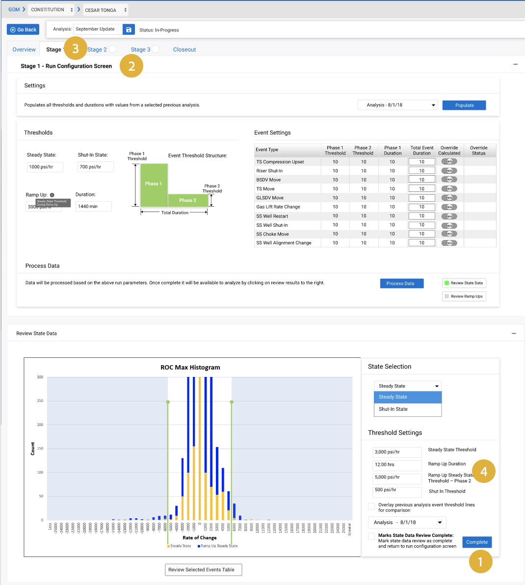
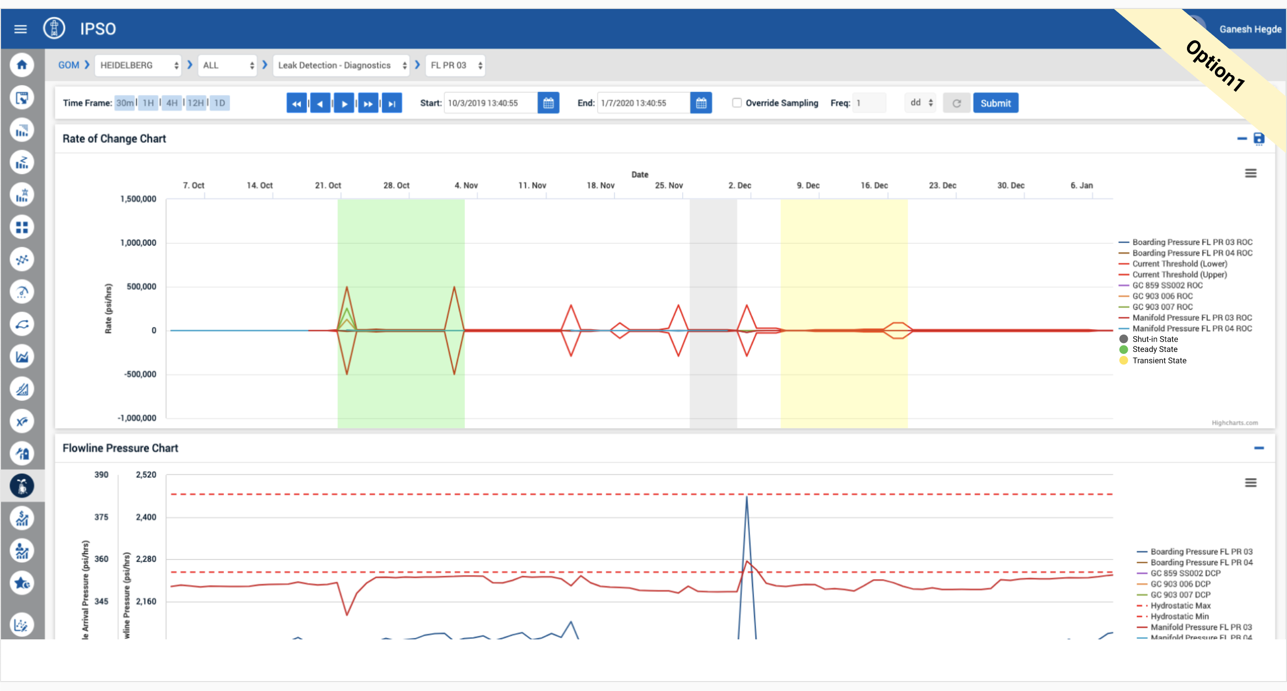
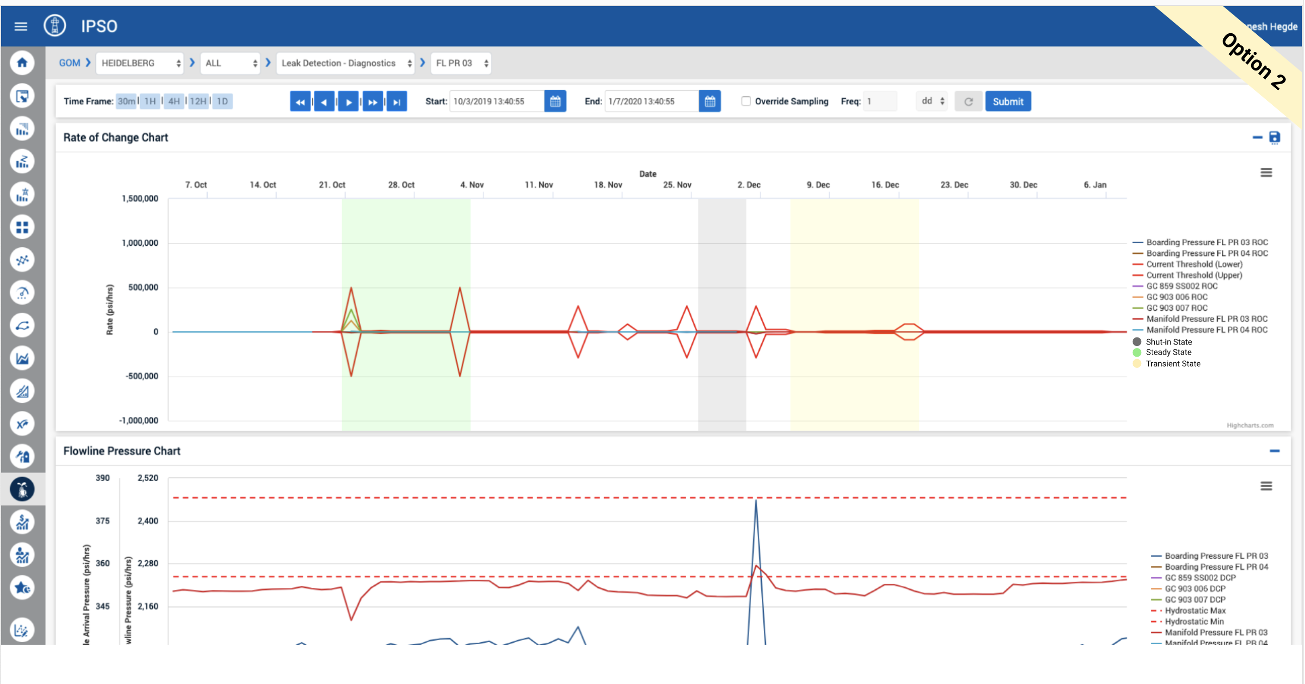
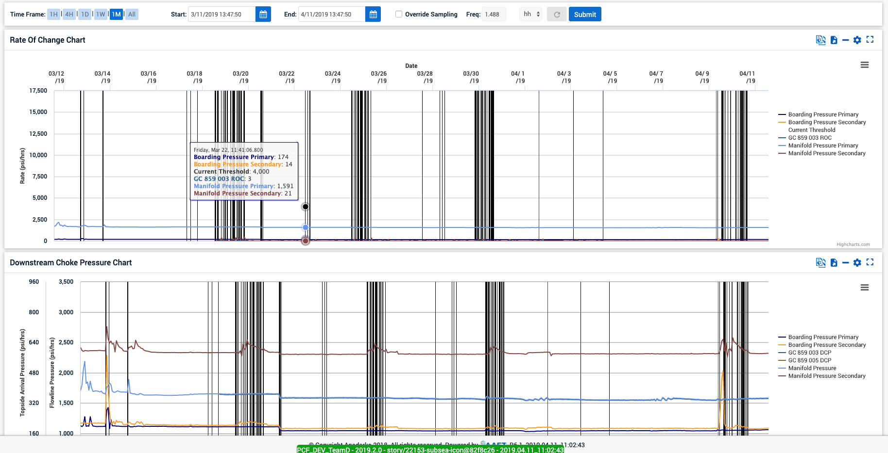
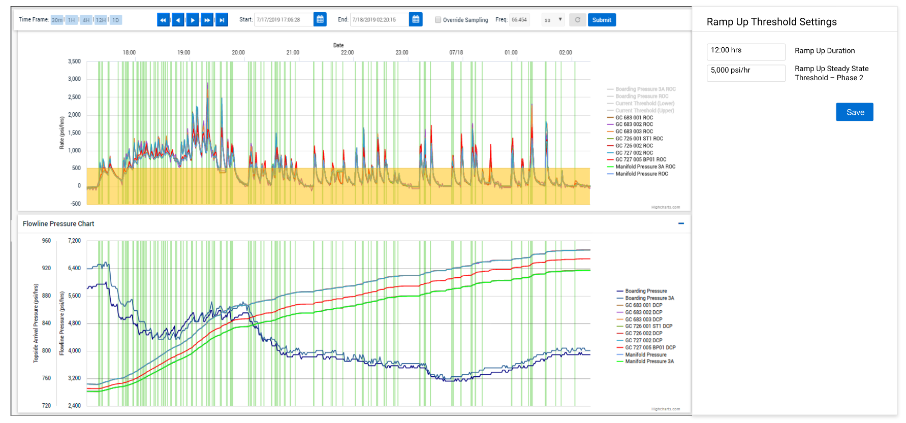
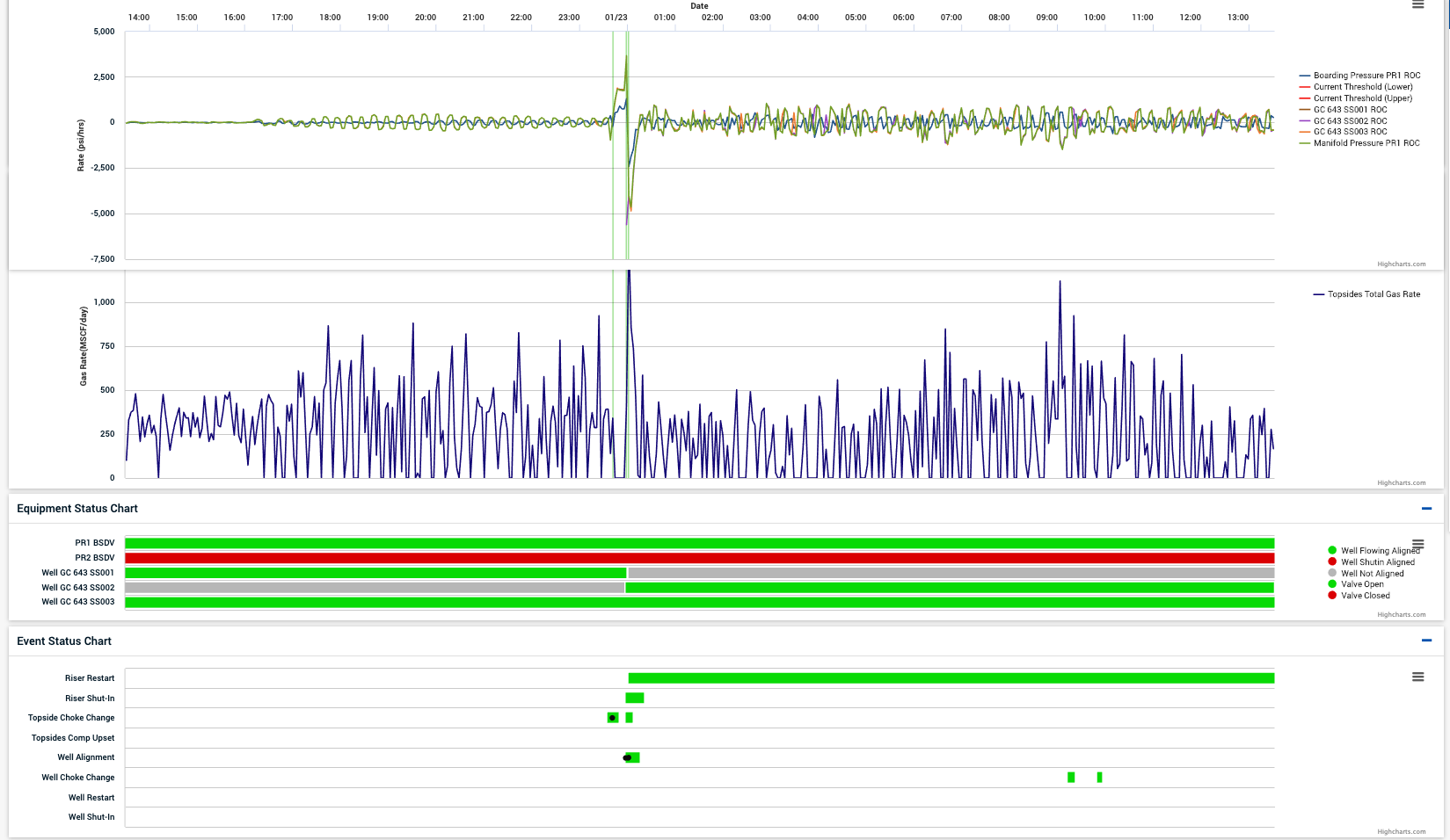
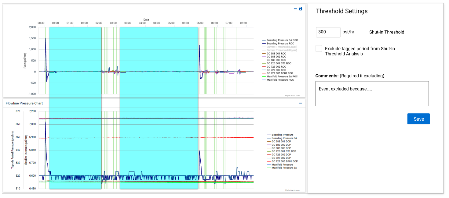
We had multiple versions of "Pressure" and "Rate Of Change" visualization wireframes to gather feedback from Production and Engineering users. This involved establishing a standardized visual hierarchy and different types of visualization.
High Fidelity Prototype
A Hi-Fi prototype was developed before user testing because interactive wireframes for user testing had not been successful in the past.
Users found it difficult to visualize how these grey boxes would magically transform into their beautifully crafted interactive visualization tool
Users often complained that our low-fidelity prototypes did not match up to their expectations of an interactive tool.
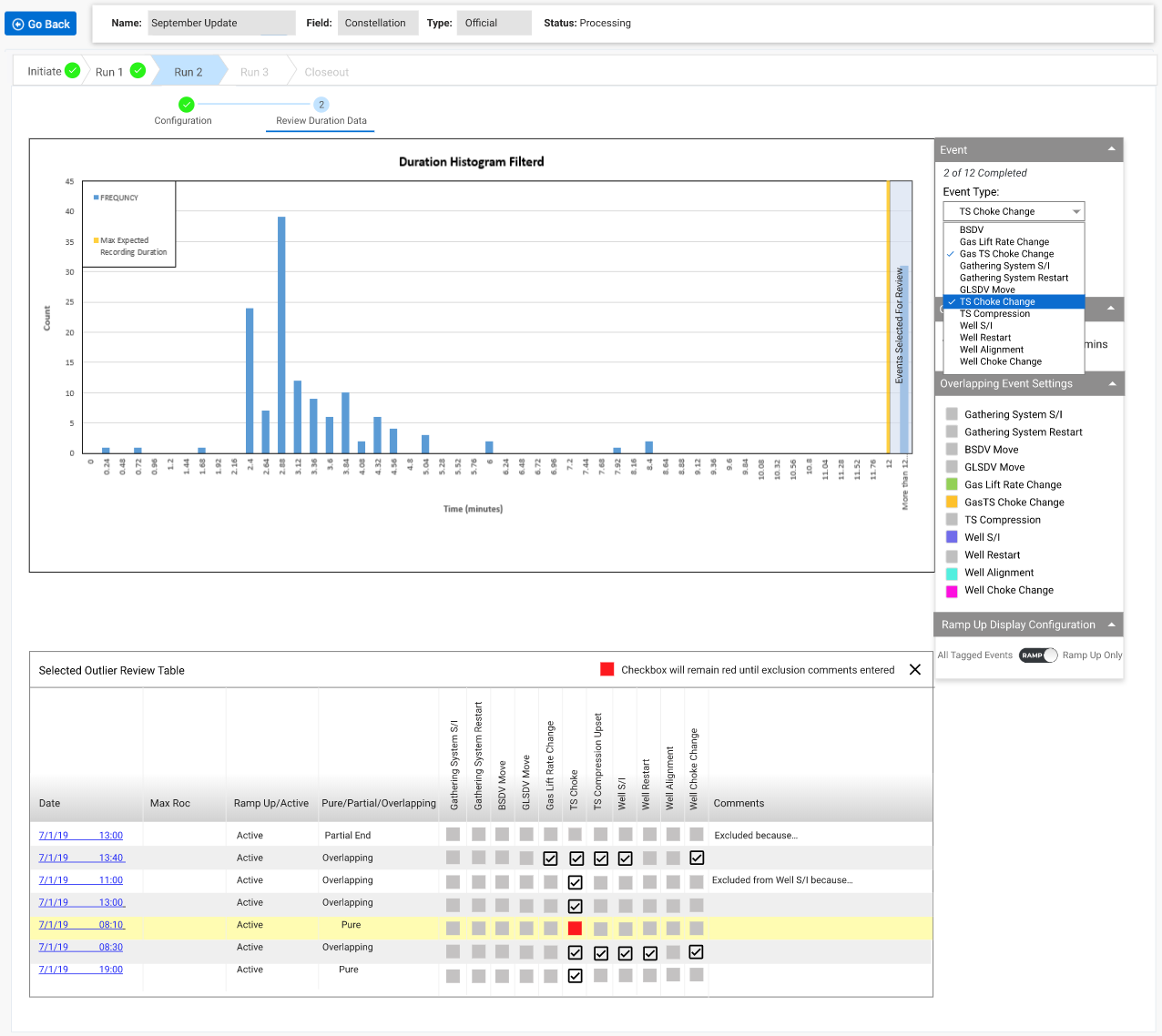
Through iterative testing and development, it was identified that, most of the time, one particular chart needed to be compared to 10 other visualizations. Locking that chart to the top solved the problem as it was the driving factor for leak detection.
Evaluation
Weekly user testing sessions on task analysis for some of the complex tasks resulted in a 35% improvement in task success.
Discovery: Confusing to match dots as events on the chart.
Solution: Scrollable lines as events on stackable charts.
Discovery: Users had a hard time identifying what stage of the process they were
currently in.
Solution: Clear visual
hierarchy that aligned with the mental map of the users.
Discovery: Users wanted to see before and after an event.
Solution:
Added buffer and a button to shift the timeframe.
Discovery:
Wanted to compare "Rate of Change" with a number of other parameters.
Solution: Make the top chart sticky.
Development and Additional Features
Worked very closely with the design team, engineering team, and stakeholders to develop prioritized backlog items. It was a continuous discovery and delivery process as we iterated through each sprint.
Result and Reflection
Using this tool, the production engineers could detect a leak sitting at their desks and act on it
without
shutting down the well, thus saving millions of dollars to the company everytime there was a false leak
alarm.
The lesson
learned is that it is important to involve the development team early in the process to understand
technical
challenges.
